Feature #1289
New UX
Status:
Closed
Priority:
Normal
Assignee:
-
Target version:
-
Start date:
04/08/2016
Due date:
% Done:
0%
Description
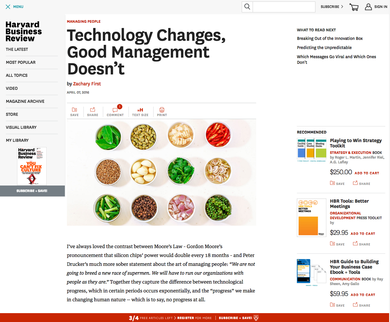
Treat this more as an app than a website.
Some thing that could be done:- Use a "hamburger" menu on the side as opposed to navigation across the top
- Keep the header across the top
- Have a floating footer at the bottom

Notice the header that becomes fixed as the user scrolls down:

Related issues
History
#1
 Updated by Luke Murphey over 9 years ago
Some themes that I could use:
#2
 Updated by Luke Murphey about 8 years ago
- Related to Feature #1400: Reader centric UI added
#3
 Updated by Luke Murphey almost 4 years ago
- Status changed from New to Closed